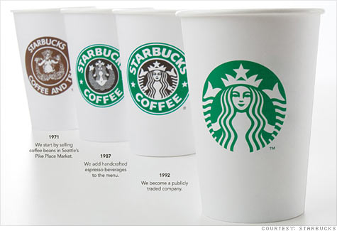
Starbucks recently decided to modify their well-known logo, dropping the Starbucks Coffee border, enlarging the emblematic siren/mermaid, and making it all Starbucks green. They're attempting to "modernize" the image and allow for the possibility of introducing non-coffee items in the future under the Starbucks brand as well as providing more emphasis on the fact that their products can be found in supermarkets and other settings besides its own retail stores.
 |
| Source: CNN Money, courtesy of Starbucks |
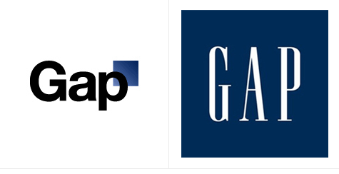
There has been a backlash from some Starbucks aficionados as some are hesitant to change, especially when it has remained the same for the past 20 years. Some like the new design, though, and the backlash is nothing compared to Gap's similar decision a few months ago, wherein they eventually stripped the new logo and reverted back to their original. In the case of Gap, however, they completed abandoned their brand with the new logo, in my mind. It was terrible business decision although some speculate it was publicity stunt to simply gain attention and the new logo was never intended to be adopted - to which Gap denies this conspiracy theory.
 |
| Source: CNN Money |
Gap's stock performance up to the date of the logo unveiling was down 12% for the year. A week later, they announced they were dropping it, and its stock has been up 21% since that point through 1/5/2011 (GPS is down a whopping 8% today, by the way). Obviously, its reversion back to its old logo isn't necessarily why the stock has performed well (correlation and causation are not nearly the same), especially considering competitors like Abercrombie, Urban Outfitters, and J Crew are up similarly over the same period (although American Eagle hasn't been so fortunate). However, it's always a good thing when you get consumers to think about your brand and its identity (assuming it has been a positive one). Perhaps bringing the possibility of the change to the forefront in the minds of many individuals, Gap consumers sought to seek out the brand again once it symbolically rededicated itself to its core principles. While the backlash may have hurt sentiment from a managerial and marketing confidence standpoint, simply getting into the discussion again does seem to reap positive rewards.
Gap's main downfall in the logo decision, in my opinion, was attempting to almost rebuke their old identity. Changing the font, the color of the font, and the style completely seemed to disregard its existing brand rather then building upon it for the future. They abandoned the classic identity and thus would potentially alienate existing consumers. If you have a decently strong brand following, that's the worst thing you can do.
Some argue that the "Starbucks Coffee" text amounted to millions of dollars in free advertising as consumers walk around with drinks in hand - while true, the new logo is readily identifiable (perhaps moreso due to the enlarging of the image) to their intended audience so I don't think the "losing free advertising" argument holds that much water. Starbucks really doesn't advertise through any paid means (print, TV, etc.) and they don't need to because of the army of consumers that walk around with their easily recognizable products in hand. Some firms branding is not dependent on being plastered on TV and billboards - much like Five Guys has recently exploded despite not advertising. Five Guys delivers a product that fulfills a niche - all natural thick Idaho potato french fries and all-beef patties made to order that satisfies the gap in the marketplace between super fast-food fries and burgers and more upscale sit-down restaurants. They have simply found the neglected niche, made a good product, and delivered results.
Starbucks new logo is similar to Gatorade dropping the full "Gatorade" text on the lighting bolt. Gatorade now simply has a "G" with the lightning bolt, sticking to their identifiable past with the lightning bolt with a simpler G identifying the brand. (Although I'm not too sure about their branding themselves as "G" when talking about the product in ads - it's a simply a letter, but that's another topic all together as it's unrelated to the logo change). Starbucks likewise stays true to their roots with the same stylized mermaid, in the same green color, while expanding their markets to possible non-coffee ventures, enlarging the image further to make it even more visible (since there is no longer a border taking up space). I think the new Starbucks logo will stick for these reasons unlike the Gap one. Whether the logo change is better than leaving it alone from a business standpoint is certainly up for debate and only time will tell if it stands the test of public scrutiny.
This post isn't investing-related exactly, but relates to business and company branding and marketing. Obviously, such decisions can have an impact of stock price and public perception so I thought it'd be interesting to mention it. Plus, I never promised all posts would be directly about investing. While I still think the vast majority of individual investors are best served by investing in low-cost index funds, those with the desire or inclination to augment their holdings with individual stocks need to pay attention to company reputation, which is certainly affected by branding.
A company's brand is perhaps its most valuable commodity. While it certainly must provide a product or service consumers desire - and Starbucks did that by revolutionizing the American coffee house and offering items previously unheard of to the American consumer - the reputation of the brand propels a good business with a good product into a great business. If Nike all of a sudden developed a new line of Air Jordans that had a defective sole that wore out in less than a month, it would still sell like hotcakes initially simply due to the Nike and Air Jordan brands. Nike has widespread appeal to their intended (widespread) demographic and have developed a product that has consistently exceeded consumers' expectations. It also has a "cool" factor, which doesn't hurt one bit. Based on this historical data, consumers assume the brand will continue to deliver exceptional results. Eventually, however, a poor product will catch up to the brand and its reputation would subsequently suffer. That's why maintaining a positive reputation is essential to a good business model as it delivers repeat customers and referrals.
On this note, if you do intend to choose individual companies to invest in, not only must they have a product that others desire, but having a good brand and reputation is key to continued financial and stock price success. That's why I encourage people to seek "best of breed" companies. If you're interested in a particular sector - say fast-food industry - one must not only look at the financial statements and valuation metrics, but its general perception among the intended demographic. If McDonald's and Burger King had the same fundamentals, I'd rather own MCD - its brand is simply stronger at this point in time in my mind.
While I'm certainly not a marketing or advertising expert, I find such business decisions intriguing, and if you invest in individual companies, you probably want to pay attention to how the company is perceived by its intended clients. I want to emphasize that last point. A company like McDonald's needs to market its brand to appeal to the masses, in particular to demographics where fast-food consumers are more readily available. On the other hand, while public perception of a company like Goldman Sachs can have an effect on its stock price, its financial well-being and long-term stock price will definitely be more affected by its financial bottom line and perception of the firm from its more high-rolling clientele. Goldman Sachs doesn't need to appeal to a 17-year old making minimum wage.
While I'm certainly not a marketing or advertising expert, I find such business decisions intriguing, and if you invest in individual companies, you probably want to pay attention to how the company is perceived by its intended clients. I want to emphasize that last point. A company like McDonald's needs to market its brand to appeal to the masses, in particular to demographics where fast-food consumers are more readily available. On the other hand, while public perception of a company like Goldman Sachs can have an effect on its stock price, its financial well-being and long-term stock price will definitely be more affected by its financial bottom line and perception of the firm from its more high-rolling clientele. Goldman Sachs doesn't need to appeal to a 17-year old making minimum wage.
Of course, a logo is not the only marketing and branding a company does. But its importance cannot be understated as it's truly the identifier of the firm. Starbucks gets a ridiculous amount of free advertising simply by consumers being on-to-go with a cup saying "Starbucks Coffee" on the side. While removing the company name gets rid of this free by-name advertising, the Starbucks mermaid/siren has become so ubiquitous and well-known that Starbucks can pull it off without any adverse affects, in my opinion. Much like Nike's swoosh - it has a simply elegance where the name is not needed. People just know the swoosh and that leads to even more allure perhaps.
On a somewhat different topic, I recall an engineering dean talking about reputational surveys and rankings. She was saying that Georgia Tech could essentially eliminate half of its labs and faculty and people would still rank it highly because of its perceived level of historical excellence over the long-term. While cutting corners might eventually cost Georgia Tech its reputation as an engineering powerhouse, in the short-term administrators and students would give it the benefit of the doubt due to its established brand. Brand significance spans beyond the corporate marketing world.
A company's reputation and brand is perhaps its most significant commodity to continued success and growth. While quantitatively analyzing such a variable proves extremely difficult, I thought it would be an interesting topic to explore in this post. While financials of a company tell an important story, the public perception of the firm cannot be overemphasized. If a firm has a bad quarter, but perhaps its due to the recession or in a cyclical sector, as long as its brand is widely recognizable or positioned in such a manner to become that way, I would select it over another competitor all else being equal.
There is no substitute for a positive reputation and brand. Building one is key for a company's long-term success.

